Catch
Improving Catch's product discoverability for a seamless shopping journey
Situation
The Catch shopping experience had slowly evolved over time to include a lot of noise and clutter which was fighting for customers attention. This impacted the ability to effectively sell important deals or showcase important information. It was critical to investigate Catch's product discoverability and improve it to allow for both customer and business success.
Task
The goal was to improve Catch's product discovery, and to do so deep research into both competitor experiences, best practices and user behaviour was important. Beyond this it was important to define the information critical to each step in the journey, including product cards, search and navigation, and find a balance between business needs and customer experience so both could thrive.
Action
I started by establishing a baseline for Catch's product discovery experience and benchmarking competitors to identify best practices. I reviewed everything from product cards and product details pages to search and navigation. Consulting with business stakeholders, I documented key pain points to guide future user testing.
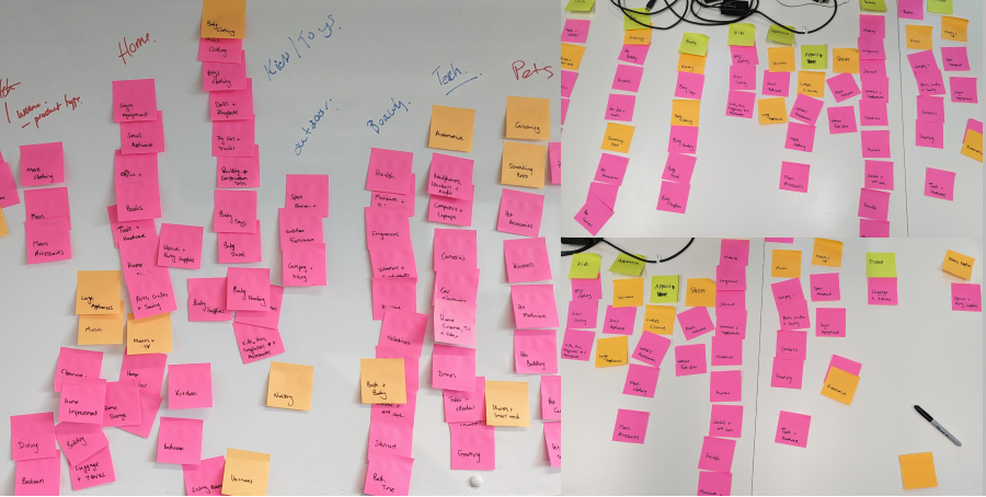
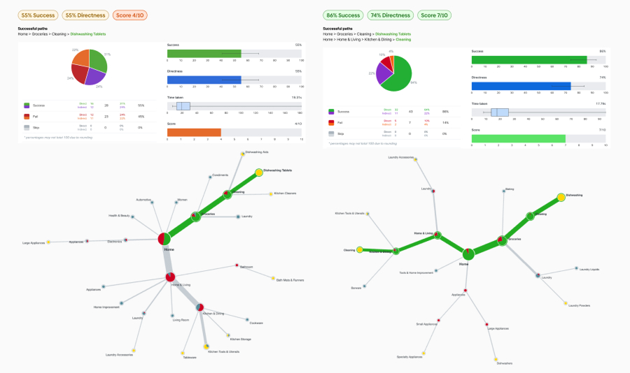
Next, I focused on improving navigation, as analytics showed low engagement and poor performance. We hypothesized that simplifying Catch's multiple category trees would enhance browsing, boost SEO, and improve the seller experience. I ran card sorting exercises with stakeholders and customers, then tested three different navigation structures with 150 users. The first tree scored 66%, the second 60%, and the final 83%, with the remaining 17% showing only uncertainty rather than errors. Given the lack of visual guidance in tree tests, this was considered a strong success.
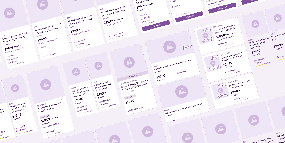
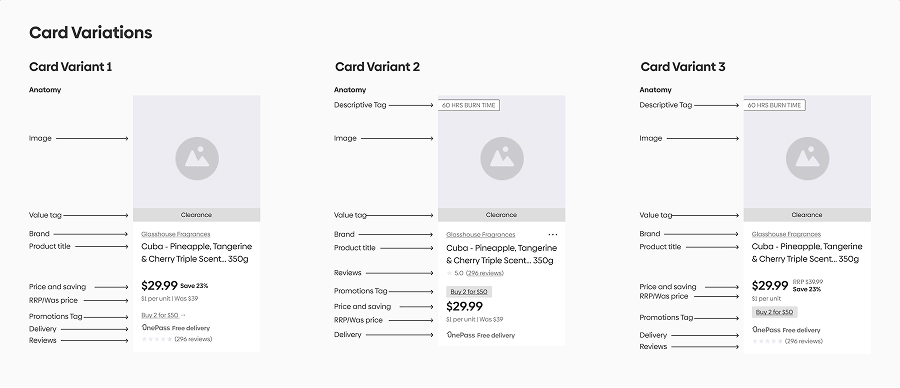
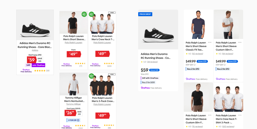
With research insights in hand, I redesigned product cards to refine the information hierarchy. Collaborating with three other designers, I developed and tested wireframes before presenting hypotheses to stakeholders. After approval, I conducted research with 48 customers through surveys and interviews. The results showed that images, price, product title, and savings were critical, and customers preferred clear savings without having to calculate discounts. This led to a clear winning design, which we refined into high-fidelity prototypes.
I then worked closely with front-end developers to build the new product cards and collaborated with backend developers to enhance the category navigation.
Result
The product card designs gained strong stakeholder support, and we ran an A/B test using them on a recommender within the product details page. While early results were promising, other priorities took precedence, and the initiative remains in the backlog.
The category navigation revamp was also highly anticipated, but implementation uncovered a major roadblock—our product data tools couldn't sync between two key systems, preventing a full transformation. Working with stakeholders, we pivoted to a simplified version that still improved SEO and the seller experience, launching it in January 2025. A more complete solution remains in the backlog.
Despite setbacks, my efforts brought together traditionally siloed departments—including finance, marketing, business development, eCommerce, legal, and more—fostering collaboration and trust. By driving alignment across teams, I helped break down barriers, creating a stronger culture of teamwork and shared problem-solving.

Everything you see here has been designed, coded and uploaded by me!
Copyright © James King, all rights reserved.