Cancer Council Victoria
Revitalising Cancer Council Victoria's website to make support more accessible
Situation
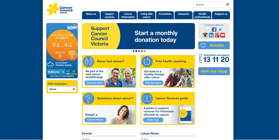
Cancer Council' Victoria's website was packed with valuable information, but users found it outdated, overwhelming and difficult to navigate. With diverse audiences—including patients, caregivers, and researchers—accessibility and clarity were critical to ensuring people could find the support they needed.
Due to the nature of a non-profit organisation, it was difficult to get budget to begin a project and a bigger redevelopment project had been on hold for several years, but with passionate colleagues and a bit of proactivity we were able to find a way to delivery a better experience without a large investment.
Task
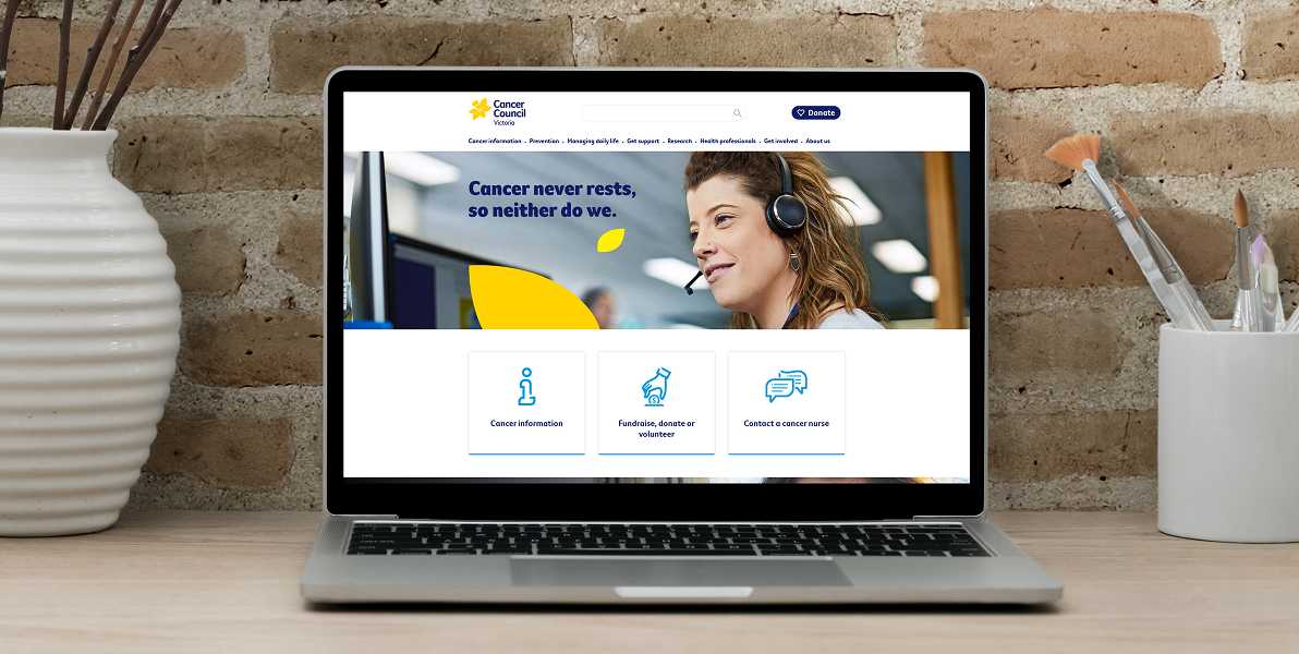
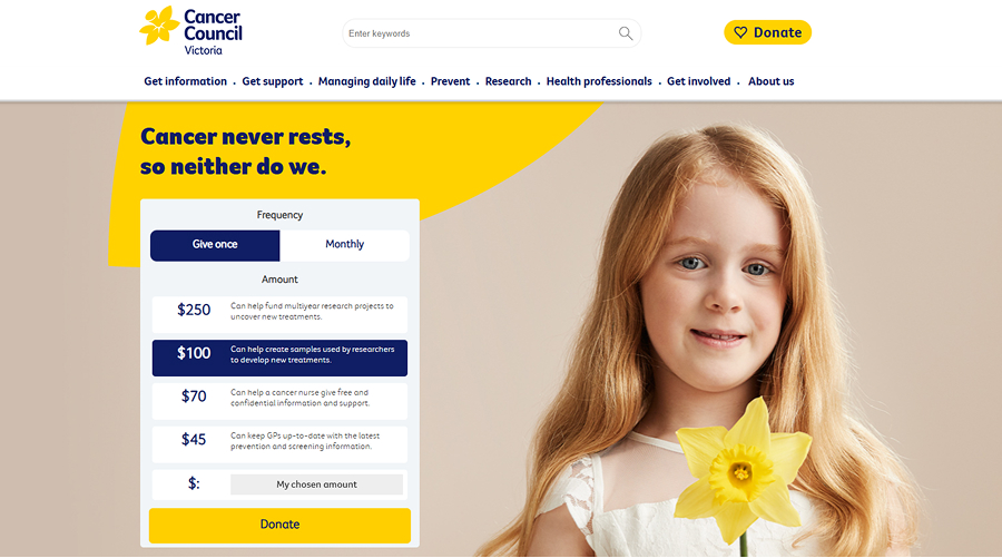
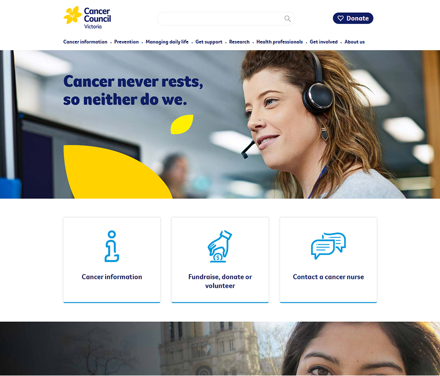
The goal was to redesign the website to improve usability, ensuring key information was easy to find while maintaining the organization's credibility and warmth and all for as little investment as possible. This meant balancing structure, accessibility, and user experience to create a site that truly served its audience.
Action
I consulted with the development team and proactively created designs that could be implemented without additional budget. The designs included a refreshed homepage and a focus on responsive design. I then presented it along with the developers and their effort estimates to the Digital Manager which gained us approval to continue our efforts.
The new designs reduced the clutter on site and simplified our sidebars to the core information users required rather than including additional call to actions.
Given budget constraints, we undertook an internal card sorting exercise and survey to determine the navigation structure for all departments. With these insights we restructured content, reduced clutter, improved navigation, and enhanced readability and created a more accessible and user-friendly experience for cancer patients, caregivers and researchers.
Result
The redesigned website made it easier for users to find the right information when they needed it most. The improved structure and navigation helped reduce frustration, increased engagement with key content, and strengthened Cancer Council's ability to connect with and support its community.
Internal stakeholders praised the project and the the improved user focus. We saw an increase in views to the contact a cancer nurse page by as much as 365% when compared to the previous year, and small increases in both the number of donations and donation values.

Everything you see here has been designed, coded and uploaded by me!
Copyright © James King, all rights reserved.